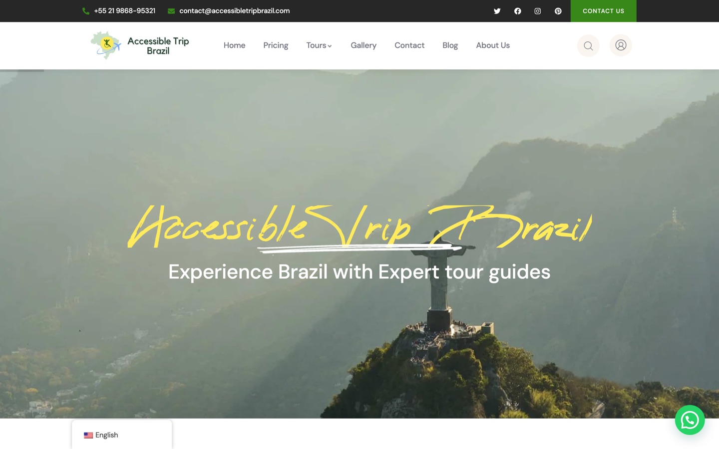
Back to our work Case study, Trip in Brazil

Brazil, planned properly. In 6 languages.

A complete travel platform for accessible and private tourism: destination pages, sample itineraries, place-level access guides, an AI trip planner, and a booking operation behind it. Audited at 100% Semrush Site Health across 313 pages.
The build

One platform, end to end.

Discover, plan, contact, book, manage
The Trip in Brazil homepage
What we built

The work, up close.

15 pieces of the build, every one a real page from the live platform.

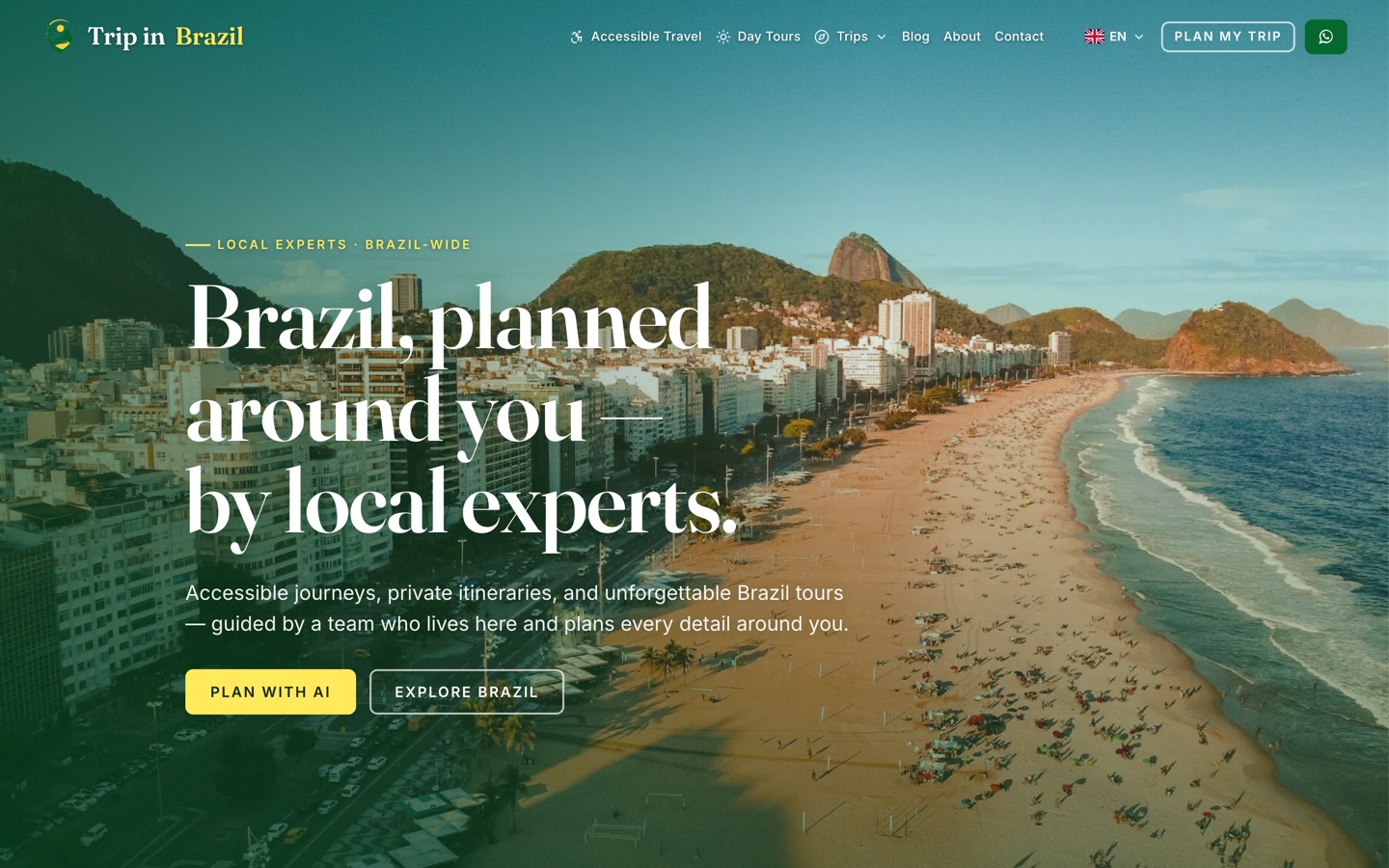
The Trip in Brazil homepage
Homepage

Lead with the differentiator, not the destination

Most travel sites open with a beach. This one opens with local experts, private planning and accessibility, because that is the reason to choose the company rather than simply visit Brazil.

2 actions: plan with AI, or browse
The AI trip planner workspace
AI planner

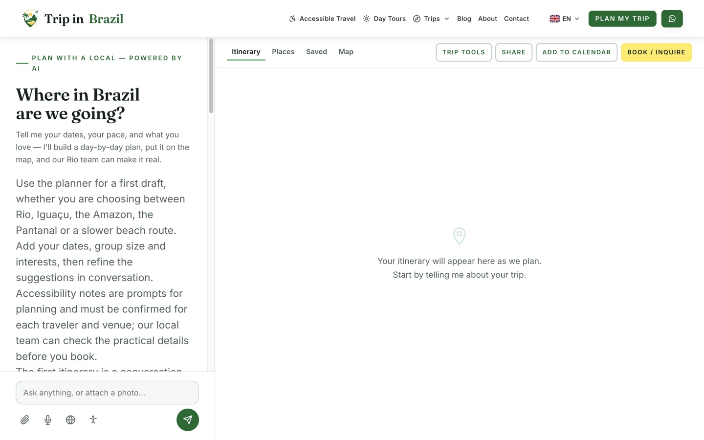
A planning workspace, not a chatbot

Day-by-day itinerary generation, place cards with map coordinates, saved places, reorder-by-proximity, and separate itinerary, places and map views. It removes the blank-page problem that stops people enquiring.

Drafts, always confirmed by a human
The accessible travel landing page
Accessibility

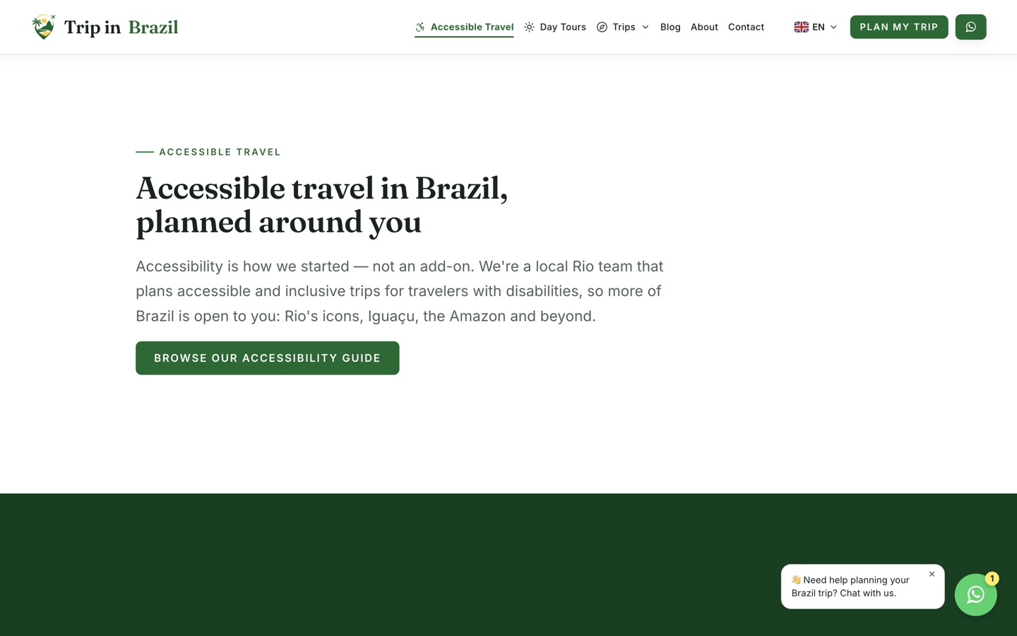
Accessibility as product depth, not a badge

Transport, accommodation, routes, attractions and pace treated as planning inputs. Deep enough that a generic operator cannot imitate it, and honest that details need confirming per traveler.

Its own service landing page
The destinations index
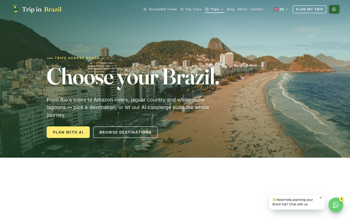
Destinations

A page each, not a card each

Every destination gets a search-focused page rather than a tile on the homepage, so a traveler searching for one place lands somewhere built for that intent.

9 destinations, individually targeted
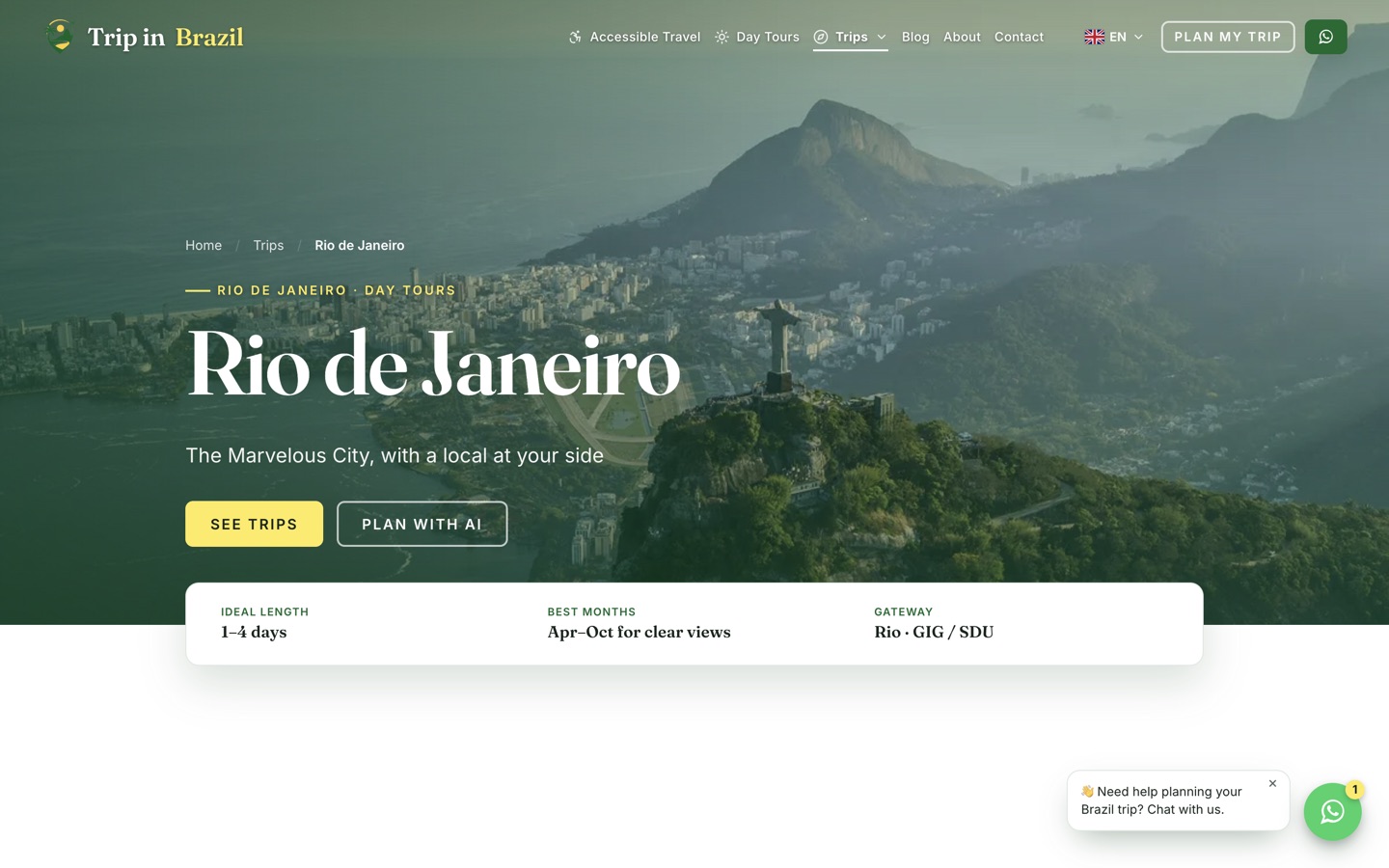
The Rio de Janeiro destination page
Destination detail

Positioning, highlights, and the practical bits

Each destination carries positioning, highlights, trip options, pricing notes, add-ons, galleries, accessibility context and a lead-capture guide.

Trip length, best season, and access at a glance
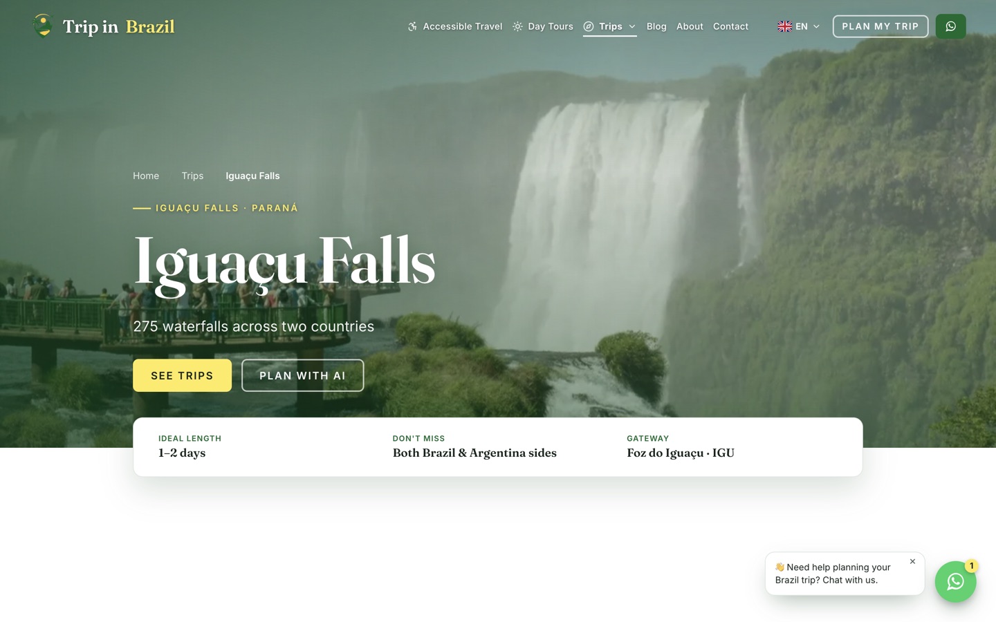
The Iguacu Falls destination page
Consistency

1 template, many destinations

The same structure repeats across every destination, so the site stays coherent as it grows and new places cost hours instead of a redesign.

Repeatable across the whole country
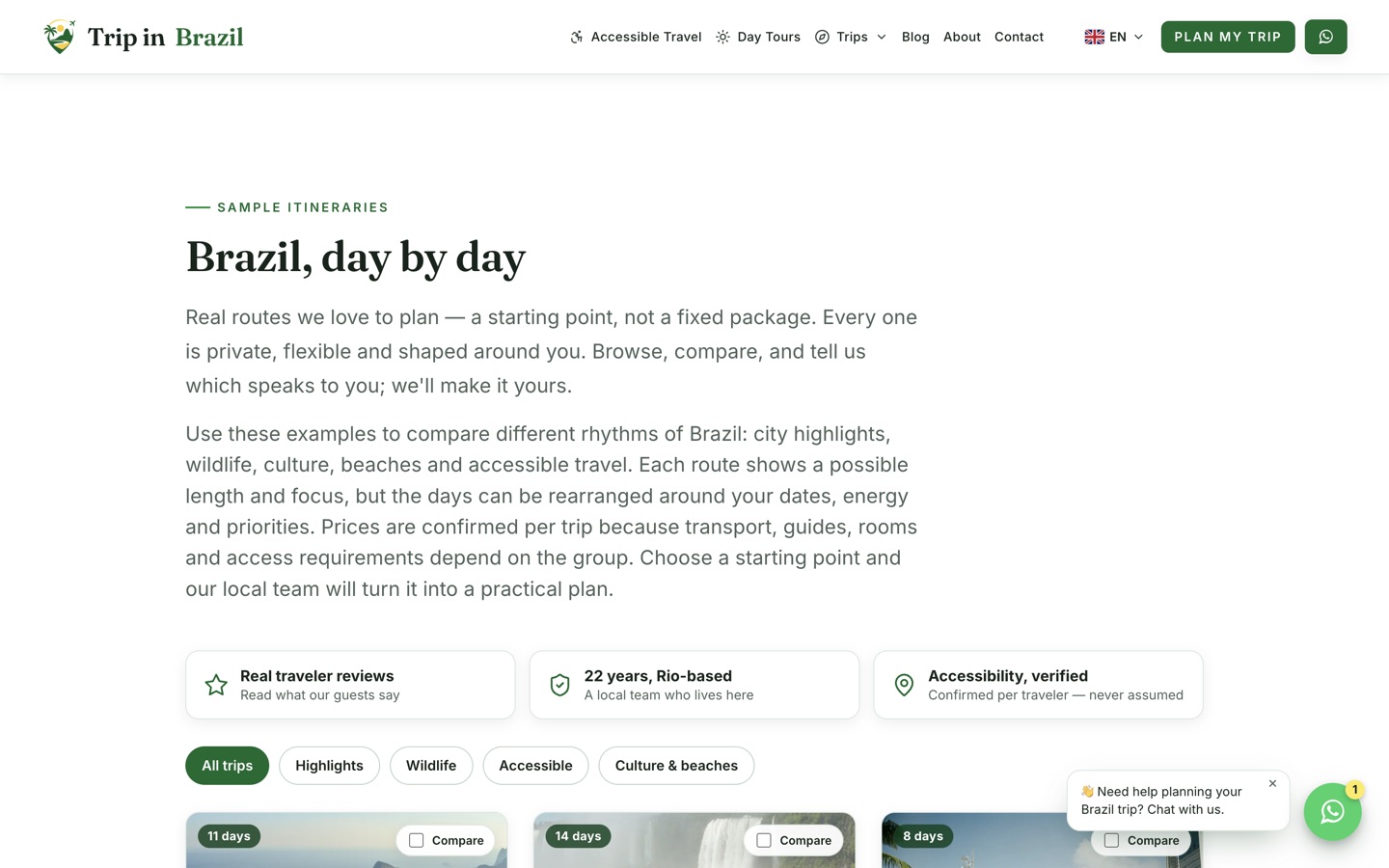
The sample itineraries index
Itineraries

Show the shape of a trip before quoting

Sample itineraries with filters and comparison let travelers understand pacing and route logic, which is what makes a high-value trip feel real enough to enquire about.

Day-by-day structure with route logic
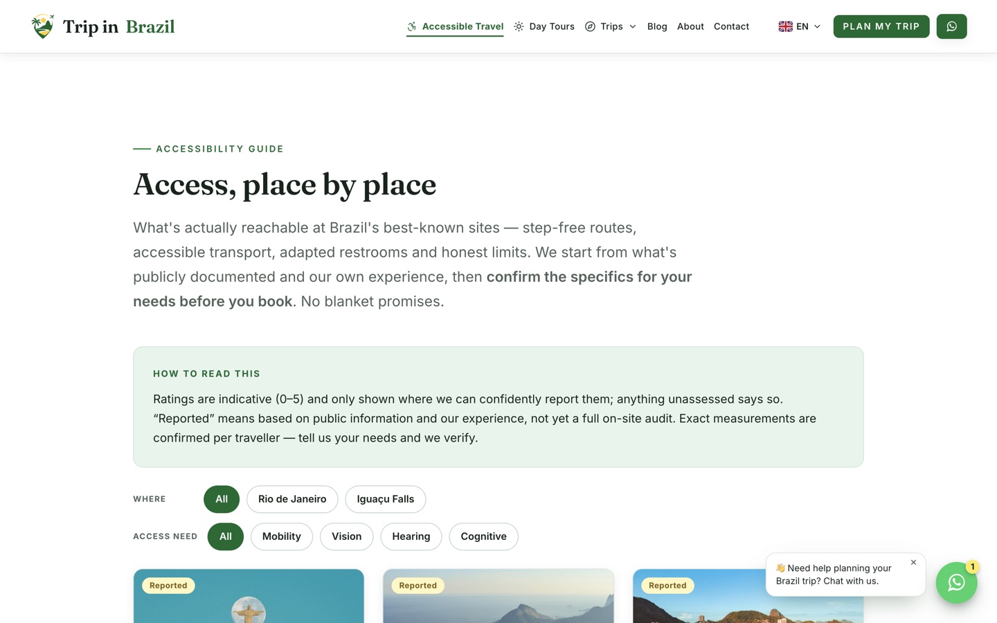
The Brazil accessibility guide index
Access guides

Place-level access, not vague promises

Structured criteria and ratings for individual landmarks turn accessibility from a claim into practical guidance, while stating plainly that details must be verified for each traveler.

Christ the Redeemer, Sugarloaf, Copacabana and more
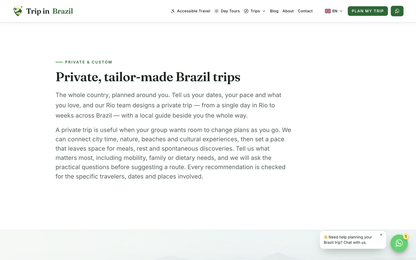
The private tours page
Private travel

Custom trips need their own argument

Private and tailor-made travel is sold differently from a fixed tour, so it gets a page that explains flexibility, pacing and personal interests rather than listing a product.

Price on request, honestly labelled
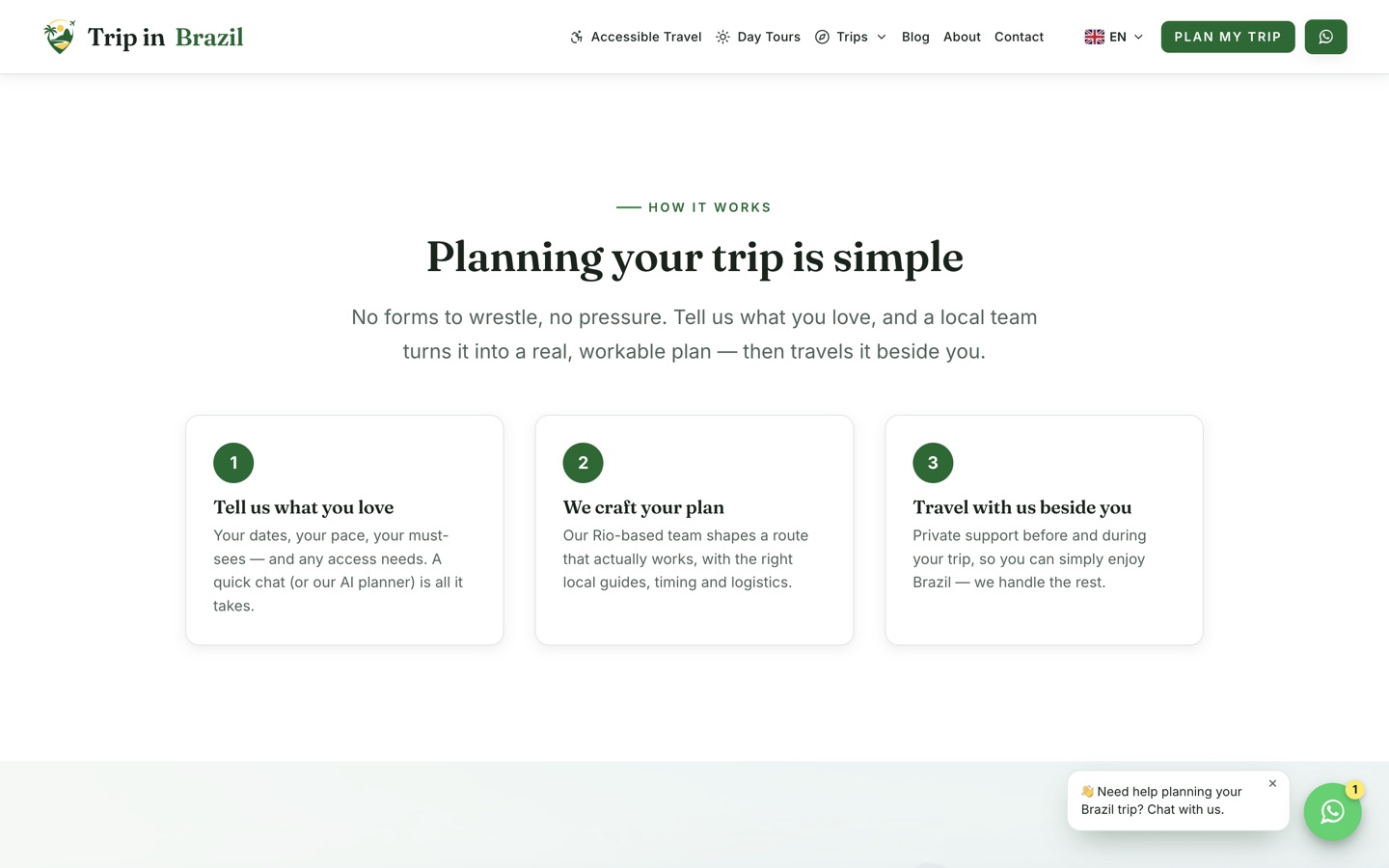
The how it works page
Process

Remove the fear of a complex purchase

A clear explanation of what happens between first contact and a finished trip. High-consideration purchases stall when the process is invisible.

From first message to finished plan
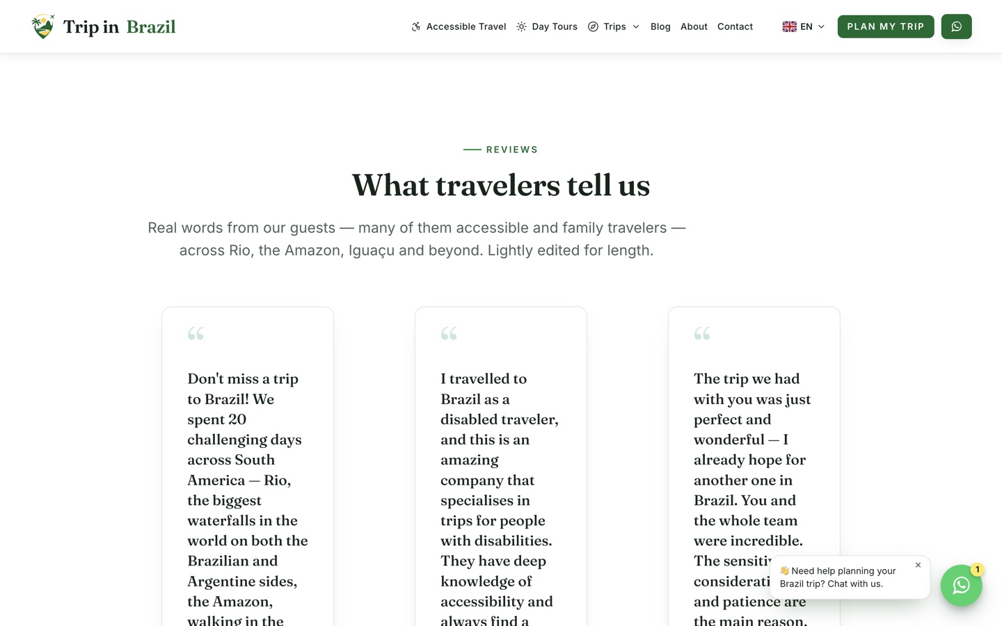
The traveler reviews page
Social proof

Real words from real trips

A dedicated reviews destination with named travelers, sitting alongside team profiles and genuine trip photography rather than stock imagery.

Reviews, team, and real media together
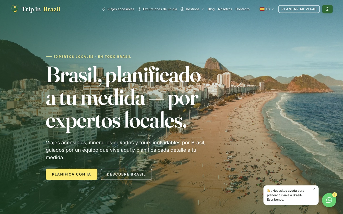
The Spanish edition of the homepage
Multilingual

6 languages, built into the routing

English at the root and clean language prefixes for Spanish, Portuguese, Italian, German and French. Localized metadata, hreflang, x-default and content overlays, with pricing pinned to 1 source so translations cannot drift.

51 canonical pages, 300+ localized variants
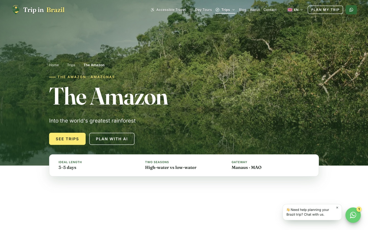
The Amazon destination page
Destination depth

The harder destinations, done properly

Remote destinations need more practical detail, not less. Access, season and logistics are covered where a generic operator would post a photo and a price.

9 destinations, none templated thinly
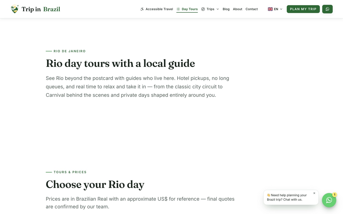
The Rio day tours page
Day tours

A different buyer to a 2-week trip

Someone booking a single day in Rio decides in minutes. That page is built for speed, while custom itineraries are built for consideration.

Short-stay intent, its own route
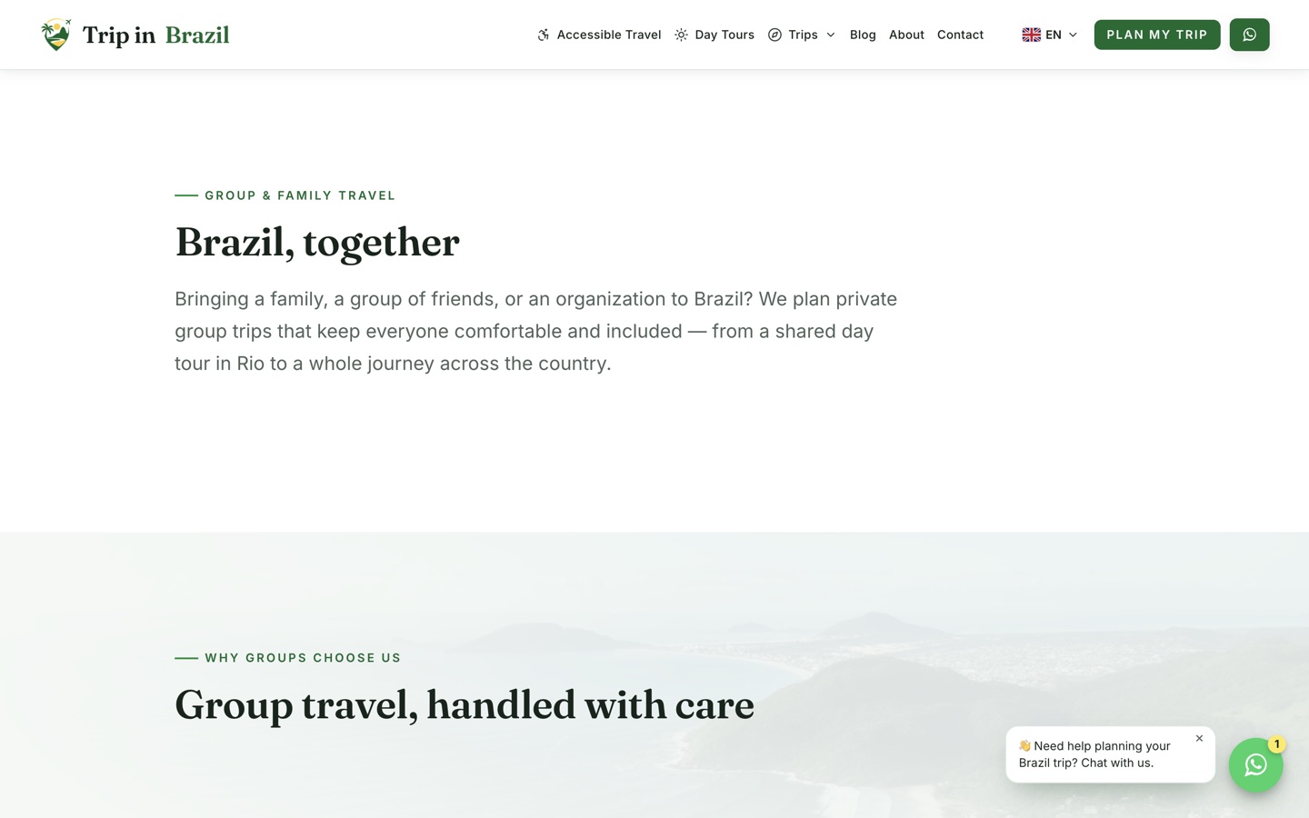
The group and family travel page
Group travel

Groups change every requirement

Pacing, accessibility, budget and logistics all shift with group size, so group travel gets its own argument rather than a line on the private tours page.

Families, groups and mixed abilities

The client.

Trip in Brazil plans local-led, accessible and private travel across Brazil, with deep expertise in Rio and a team based in the country rather than a remote reseller.

51Canonical pages
6Languages
313Pages crawled clean
At a glance

The engagement, on paper.

Client
Trip in Brazil, specialists in accessible, private and custom travel planning across Brazil.
Industry
Accessible tourism, private tours, and custom itineraries for international travelers.
Scope
Brand positioning, editorial design, landing-page system, destination and itinerary architecture, AI planner, multilingual routing, SEO, analytics, and an admin operations platform.
Stack
Cloudflare Pages and Pages Functions, TypeScript, D1, R2, Gemini for planning, Leaflet for maps, esbuild.
Languages
English, Spanish, Brazilian Portuguese, Italian, German and French, each with its own URL space.
SEO audit
100% Semrush Site Health with 0 errors, 0 warnings and 0 notices across 313 crawled pages, recorded at project QA in August 2026.
Conversion model
AI planning, WhatsApp, consultation calls, contact forms, and guide downloads matched to buyer readiness.
The challenge

A specialist offer in a generic market.

Travel is crowded with marketplaces and stock-photo landing pages. The difficulty was standing apart without narrowing the audience.

Specialist without feeling clinical

Accessibility expertise had to come through clearly while the brand still appealed to families, couples, groups and premium private clients.

Rio depth, Brazil breadth

Deep Rio knowledge is the credibility, but the company sells the whole country. Both had to be true on the same site.

Three very different buyers

One visitor wants inspiration, another wants a ready-made tour, a third needs a fully custom plan. A single funnel serves none of them well.

International from day 1

Visitors arrive from several countries, so language could not be a widget bolted onto an English site.

A high-consideration purchase

Custom accessible travel is expensive and personal. Starting an enquiry has to feel easy rather than like committing.

The team must run it

The site had to be operable after launch without a developer for every content change or booking update.

Project goals

7 goals, in order.

01

Sell the difference

Lead with local expertise, private planning and accessibility rather than another photo of a beach.

02

Give every intent a page

Destinations, itineraries, access guides and services each get a real landing page built for that search.

03

Make starting effortless

Let a visitor begin planning without composing a formal enquiry from a blank page.

04

Keep the human visible

Use AI to accelerate discovery, then route every complex decision back to the local team.

05

Localize the architecture

Build 6 languages into routing, metadata and content rather than translating a homepage.

06

Make SEO structural

Handle search in rendering and routing so quality is the default rather than a later cleanup.

07

Connect marketing to operations

Leads, consultations, bookings, staff and payments live in the same platform as the marketing site.

Our strategy

The decisions behind the platform.

Lead with the operator, not the country

Anyone can show Brazil. Only this team can offer local, accessible, private planning, so that promise sits above the fold instead of a generic destination line.

Use AI to remove the blank page

The hardest part of a custom trip is starting one. A planner that drafts an itinerary converts hesitation into intent, then hands a well-formed brief to a human.

Never let AI invent the facts that matter

Prices stay pinned to controlled source data, dates and coordinates are validated, and access details are always marked for human confirmation. Wrong access information ruins a trip.

Localize the routing, not the words

Each language gets real URLs, canonicals, hreflang and localized content, with English fallback and monetary values restored from 1 source so translation cannot cause pricing drift.

Price honestly

Known items carry estimates and custom journeys are marked price on request. False precision in travel destroys trust at exactly the moment it matters.

Degrade gracefully

Where an integration is not configured, the interface offers a working alternative instead of pretending. A print and WhatsApp path beats a button that silently fails.

The AI planner

What the planner actually does.

Day-by-day drafting

Streaming conversational planning with suggested prompts, generating a structured itinerary rather than a wall of text.

Places and maps

Place cards with descriptions and coordinates, day-specific routes on an interactive map, and reorder-by-proximity to make a day physically sensible.

Accessibility mode

A dedicated planning mode and a reusable traveler profile for access needs, with every access detail flagged for human confirmation.

Take it with you

Shareable trip links, collaborative comments, calendar export, and a print or PDF workflow for travelers who want it offline.

Human handoff

A prefilled WhatsApp enquiry carries the draft to the local team, so the conversation starts with a real plan instead of an empty greeting.

Guardrails

Sanitized output, validated dates and coordinates, controlled pricing sources, and stored-value limits keep a generative feature commercially safe.

The difference

Template travel site versus this.

Typical travel siteTrip in Brazil
PositioningLeads with destinationsLeads with local, accessible, private planning
DestinationsCards on a homepageA search-focused page each, with access context
Starting a tripA contact form and a blank message boxAn AI planner that drafts before you ever write
AccessibilityA line in the footerServices, guides, place ratings and planner modes
LanguagesA translation widget6 locales in routing, metadata and content
PricingVague or falsely preciseEstimates where known, price on request where not
OperationsLeads land in an inboxLeads, bookings, staff and payments in one admin
The results

100% site health. 0 errors.

Recorded in Semrush at project QA in August 2026, after iterative technical remediation. A point-in-time audit, not a permanent guarantee.

100%Semrush site health
0Errors and warnings
313Pages crawled
6Languages live
Business impact

What it changes for the business.

Found in 6 languages

Every destination, itinerary and guide is indexable in each locale, so international travelers arrive in their own language.

Enquiries arrive half-formed

A planner draft means the team receives dates, interests and access needs instead of "can you tell me about Brazil?".

Accessibility becomes a moat

Service pages, place guides, planner modes and interface behaviour combine into depth a generic operator cannot copy quickly.

Trust before the ask

Reviews, team profiles, real media and process explanation answer the risk questions before any call to action.

Marketing and operations connected

Leads, consultations, customers, bookings, staff and payments live together, so nothing is retyped between systems.

The team can run it

Blog, destinations, media and bookings are all editable in the admin, so growth does not queue behind a developer.

Questions

The short version.

How do you get a 100% site health score?

By treating SEO as part of rendering rather than a later cleanup, then crawling and fixing until nothing is left:

  • Structural first: server-rendered HTML, self-referencing canonicals, hreflang across 6 locales with x-default, and a consistent trailing-slash policy.
  • Then remediation: title lengths, meta descriptions, redirects, crawl parity, image sizing, content ratios and duplicate URL handling, crawled repeatedly until clean.
  • Honest framing: the result was 0 errors, 0 warnings and 0 notices across 313 pages at project QA. Any site can regress as content changes, so it is a snapshot worth re-running.
Is the AI planner a gimmick?

It exists to solve a specific commercial problem, not to look modern:

  • The problem: custom travel enquiries stall because writing the first message is hard.
  • The mechanism: the planner drafts a day-by-day itinerary with real places and a map, so the traveler has something concrete before contacting anyone.
  • The handoff: a prefilled WhatsApp message carries that draft to the local team, who verify the practical details.
  • The guardrails: prices come from controlled data, dates and coordinates are validated, and accessibility details always require human confirmation.
What does 6-language support actually involve?

Considerably more than translating the words:

  • Routing: English at the root, clean prefixes for the rest, with middleware dispatching to the same page implementation.
  • Metadata: localized titles, descriptions, Open Graph locale data, canonicals and full hreflang clusters with x-default.
  • Content: localized destination, itinerary, accessibility and blog overlays, with English fallback when a translation is missing.
  • Safety: monetary values restored from a single English source so a translated page can never show the wrong price.
Why build on Cloudflare rather than a CMS?

Because the business needed both speed and an operations layer:

  • Edge rendering: Pages Functions render localized HTML close to the visitor, with static assets bypassing function execution entirely.
  • Real data: D1 holds structured content and operations, R2 serves media through validated immutable URLs.
  • One system: the marketing site and the booking operation share a codebase instead of being stitched together with plugins.
Can Rizer build a platform like this for us?

This is the right shape of project when the offer is complex and the buying decision is slow:

  • Good fit: high-consideration services, international audiences, and businesses whose operations should live alongside the marketing site.
  • What carries over: the landing-page system, localization architecture, structured content model and admin pattern.
  • Next step: book a free call and tell us what you are selling and to whom.
Keep exploring

More case studies.

View all
Your turn

Selling something complex? Make starting easy.

High-consideration purchases stall when the first step feels like work. We design the path that gets someone from curious to in conversation.