A specialist audience
Travelers with disabilities and their companions need more information and more confidence before contacting a company than a typical leisure buyer.
A complete international travel platform: destination and tour pages, long-form guides, a 205-image accessible gallery, and 6 full language editions, delivered as static output on Cloudflare's edge with zero missing assets.
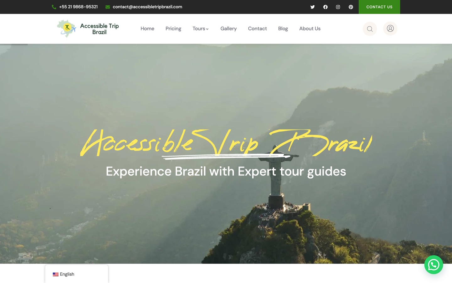

15 pieces of the build, every one a real page from the live site.
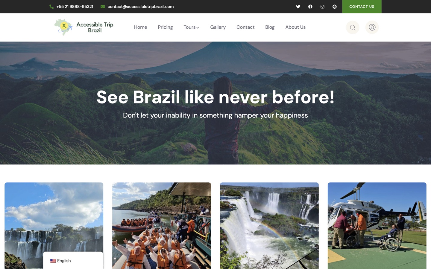
A cinematic two-frame hero sets the emotional scale, then the page moves deliberately through destinations, tours, experience, proof and contact. Accessible travel buyers need more reassurance before making contact, so the order matters.
14 sections, 1 continuous journey
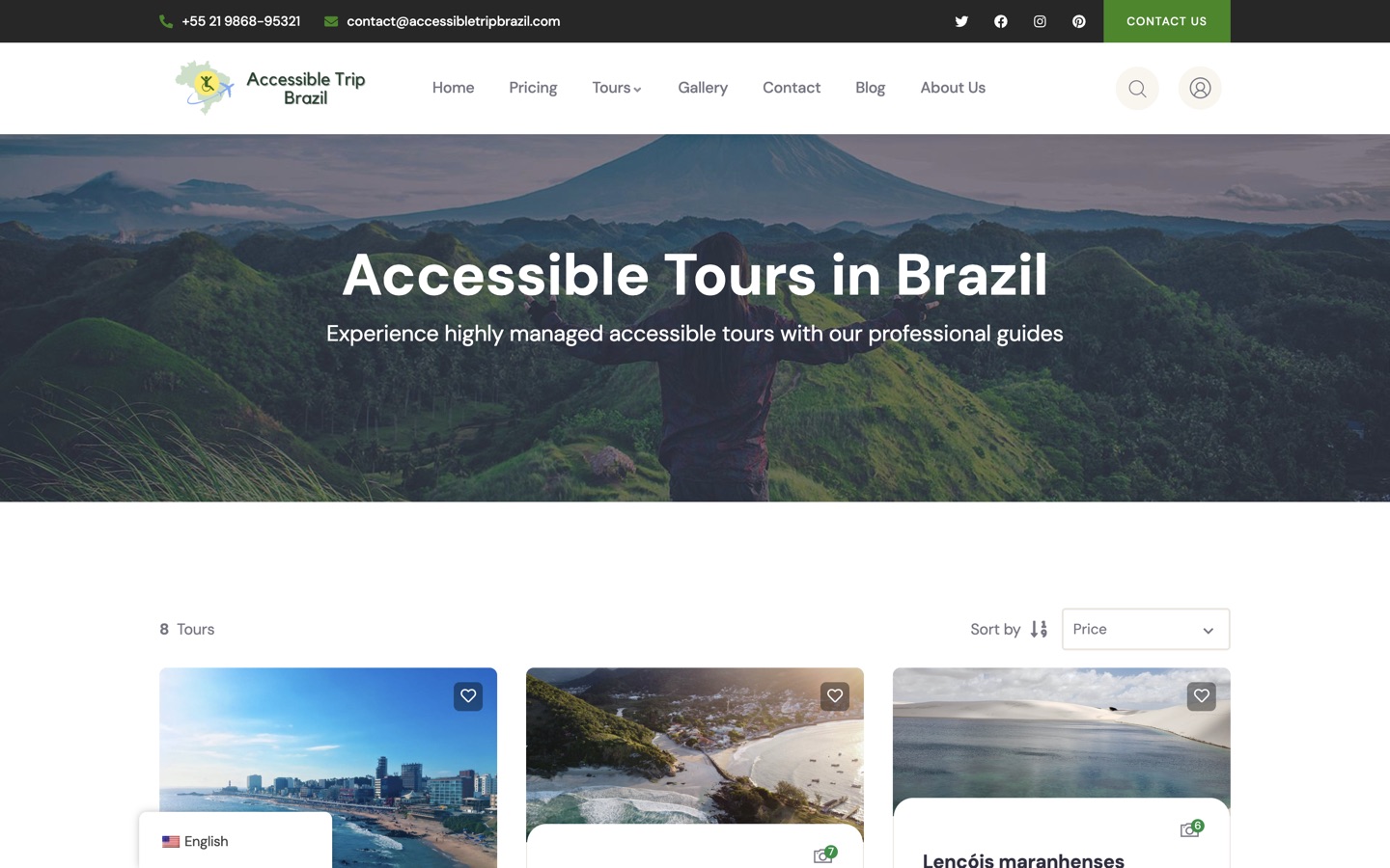
Image-led cards with destination names and explore actions make the inventory scannable, so a visitor can shortlist before committing to a long page.
9 destinations, 1 scannable grid
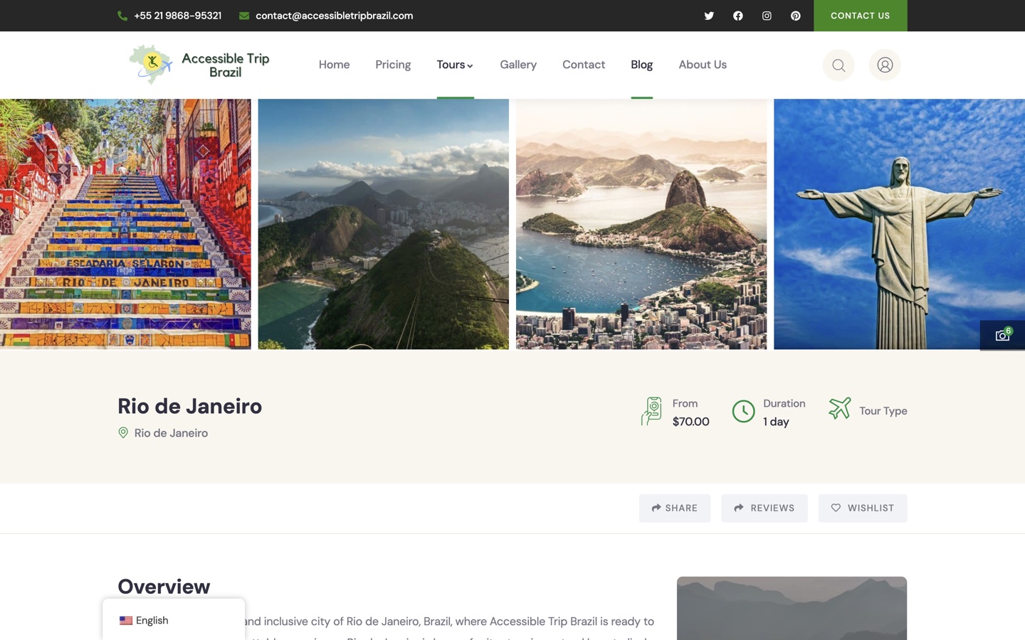
Starting price, duration, tour type, overview, inclusions and exclusions, a stage-by-stage plan, route information, guest limits, languages, reviews and related tours, with the booking sidebar staying visible on desktop.
Every question, before the enquiry
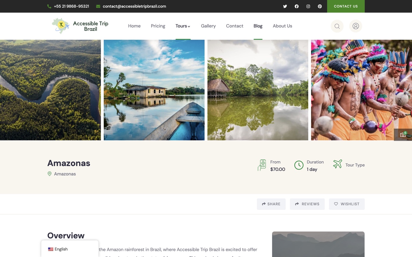
The same detailed structure repeats across each destination, so a traveler comparing the Amazon against Rio is comparing like with like.
Repeatable across the catalog
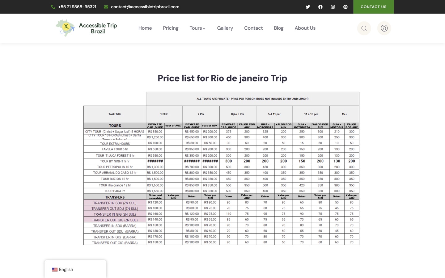
Cost and package context consolidated in one place for visitors comparing options, with clear routes back into tours and inquiry rather than a rigid transaction.
Consultation-led, not checkout-led
The gallery is trust infrastructure, not decoration. Thumbnails load progressively, and opening one loads the full-resolution original while preloading its neighbours.
205 lightbox items, 2 curated groups
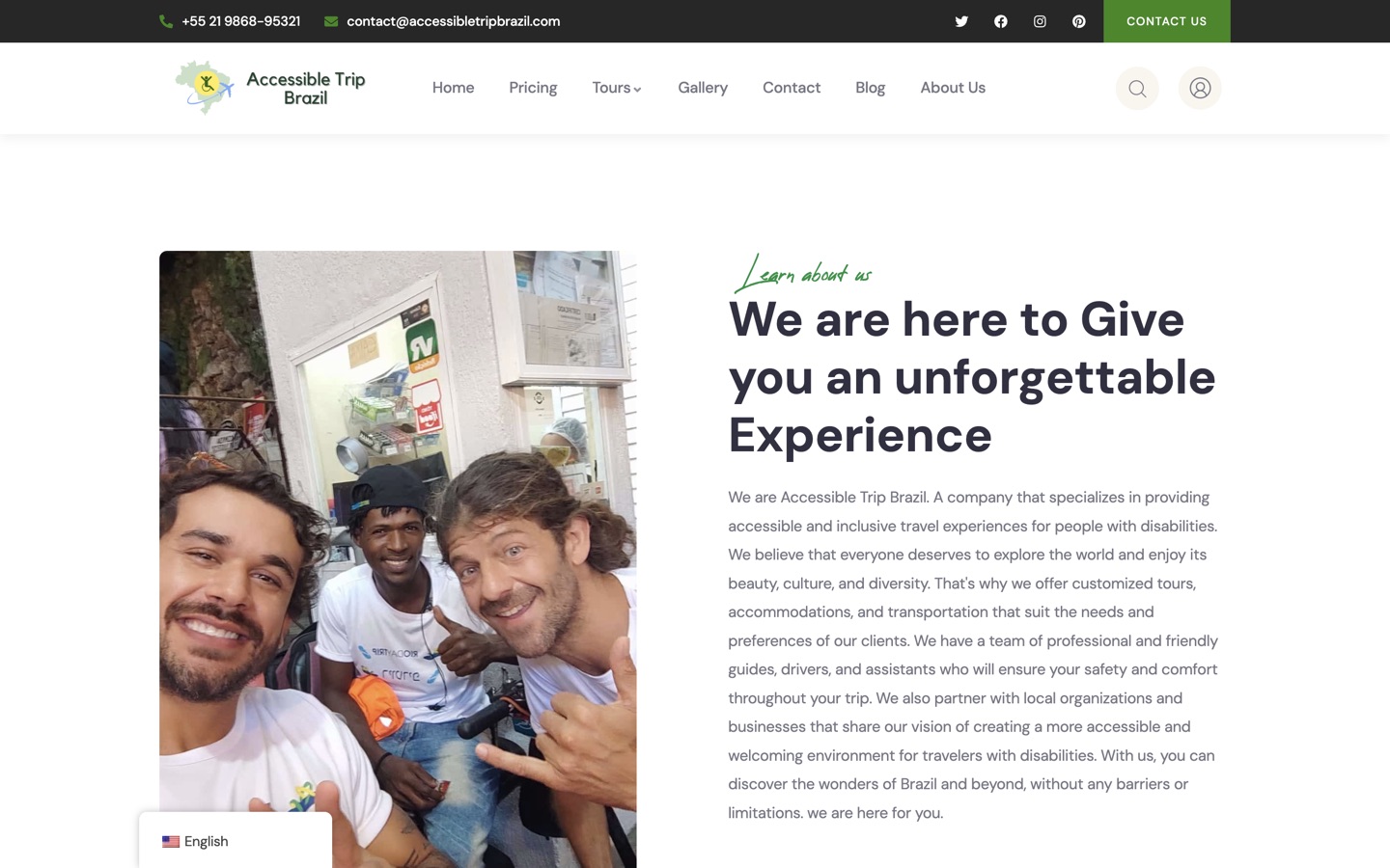
Brand story, named team profiles and testimonials. In accessible travel, travelers are buying confidence in people long before they buy an itinerary.
23+ years, named team
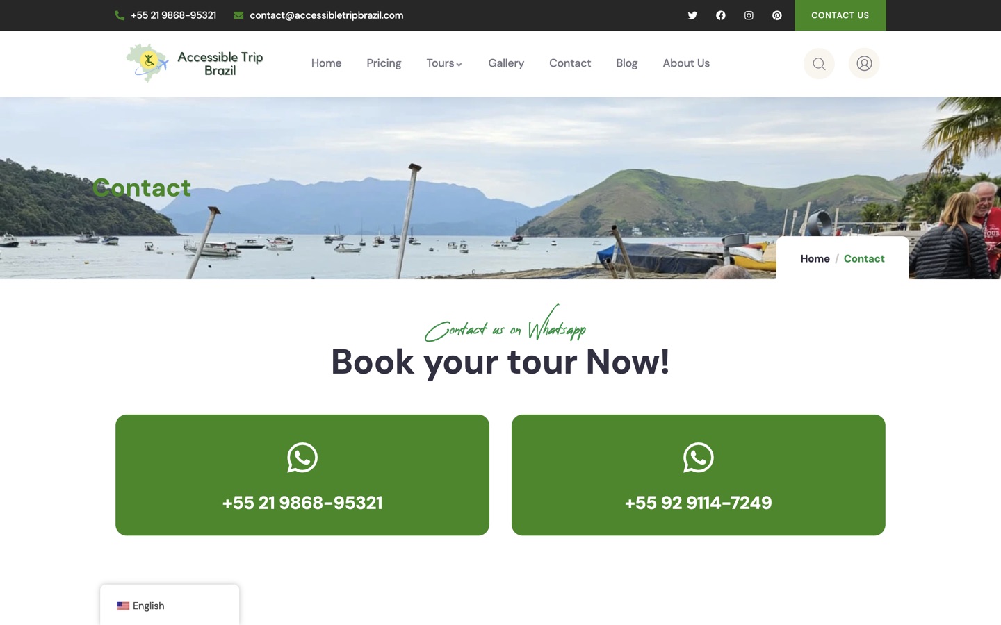
WhatsApp, phone, email, a contact form and a lazily activated map. No account creation, because customized accessible travel starts with a conversation about individual needs.
No registration barrier
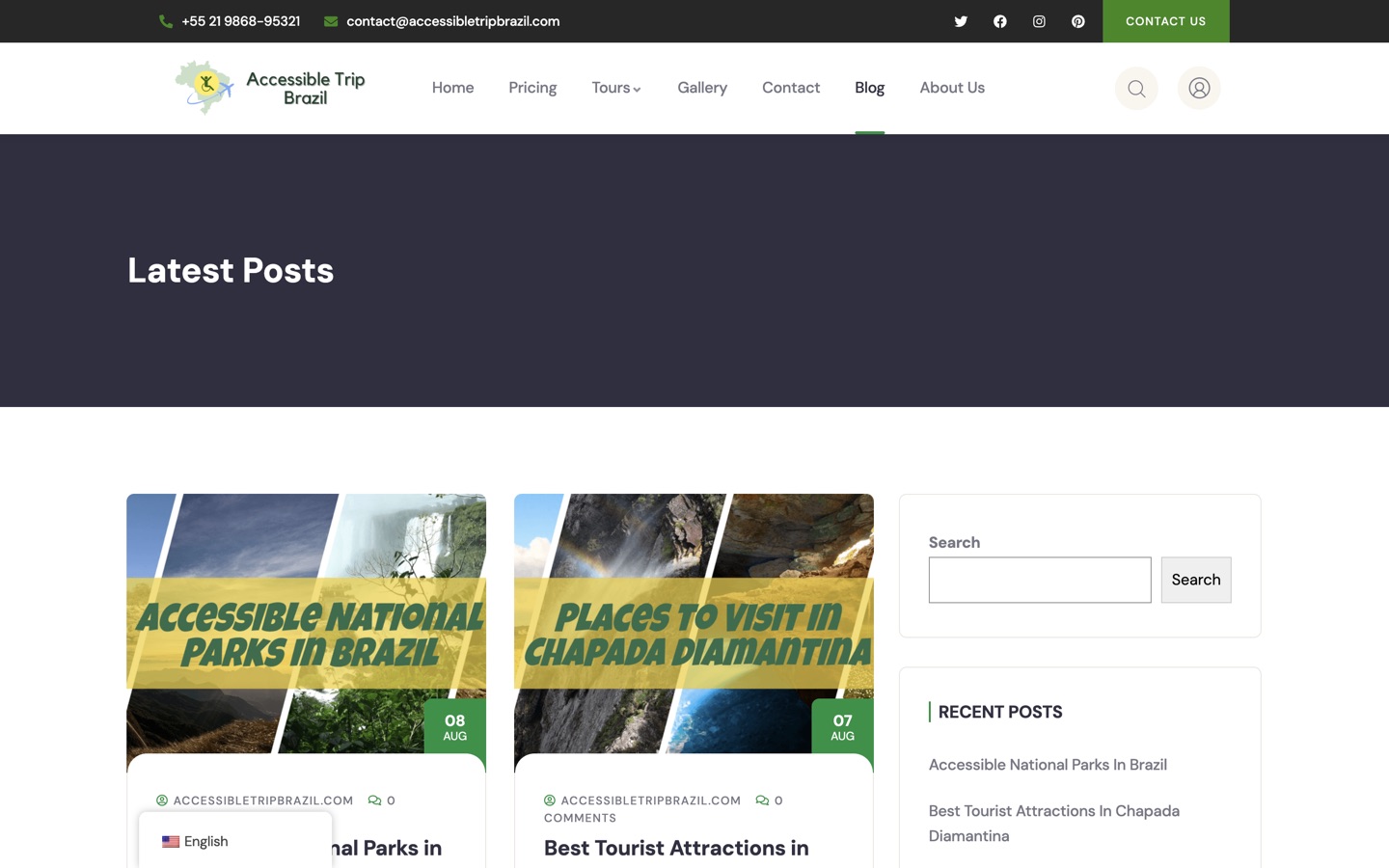
A blog connecting recent posts, categories and long-form guides, giving visitors who are not ready to enquire a productive next action.
Search entry points earlier in the funnel
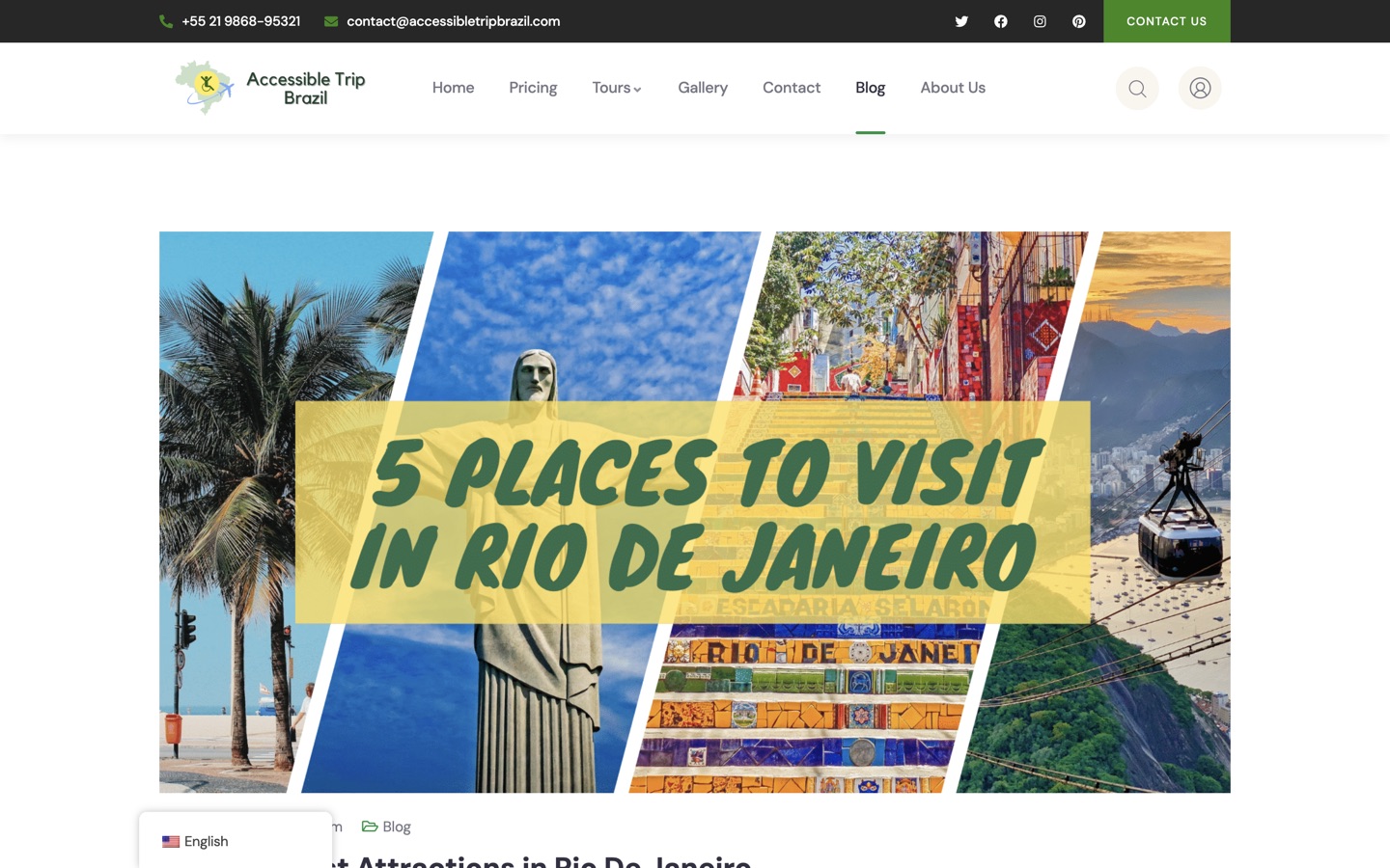
In-depth articles with hierarchical headings, real imagery and internal links into the commercial pages, covering attractions across 14 destinations and topics.
16 editorial guides
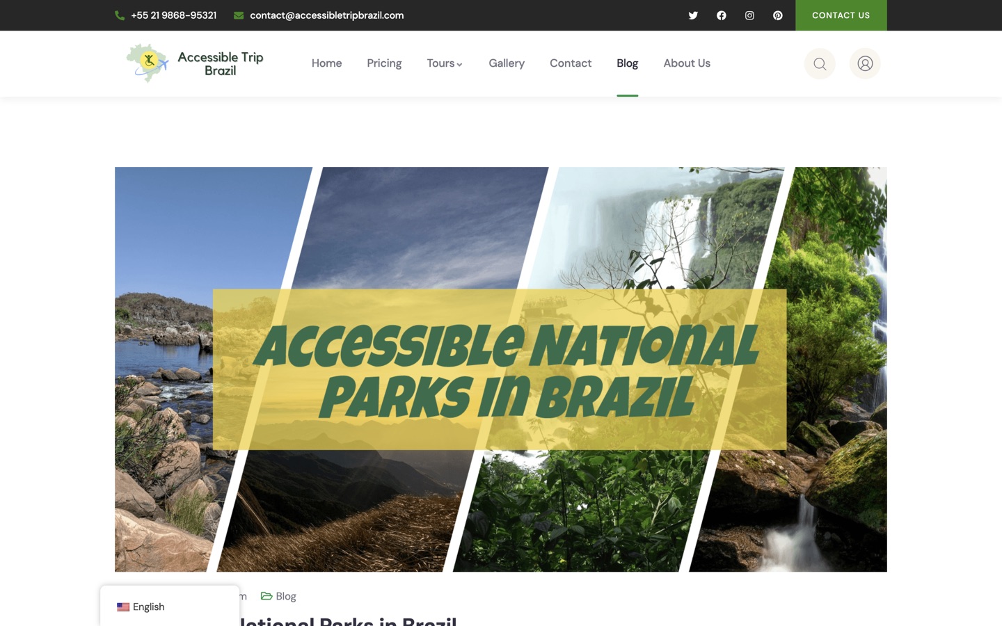
Guides on accessible parks, beaches and wheelchair travel in Brazil are both genuinely useful and impossible for a generic operator to imitate credibly.
Expertise as content strategy
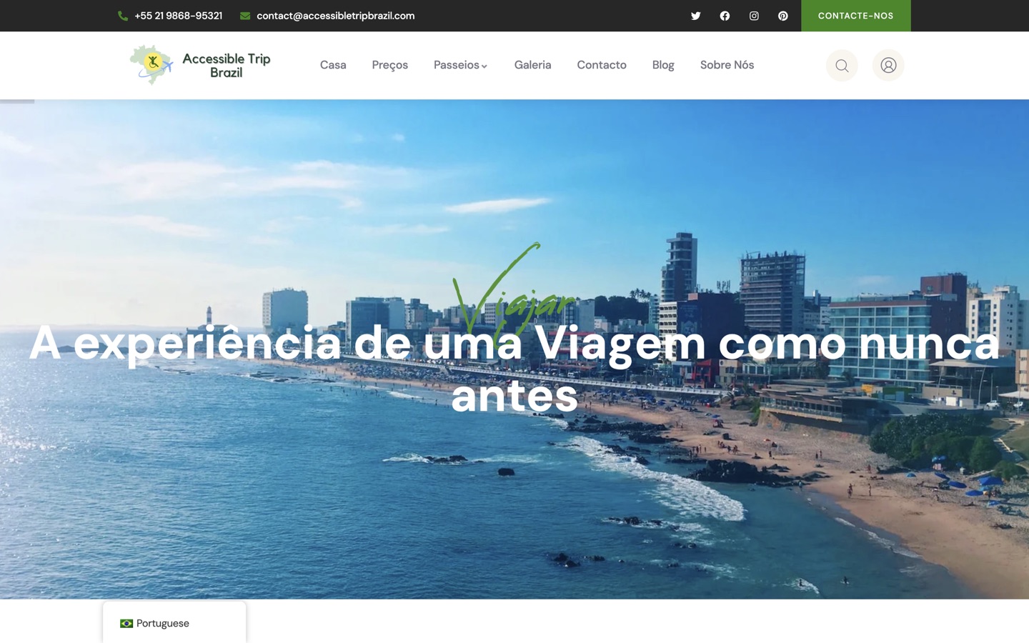
Navigation, copy, chat text, metadata, language relationships and calls to action are all localized, so an international visitor can keep researching in their language after leaving the homepage.
240 localized routes, 228 indexable
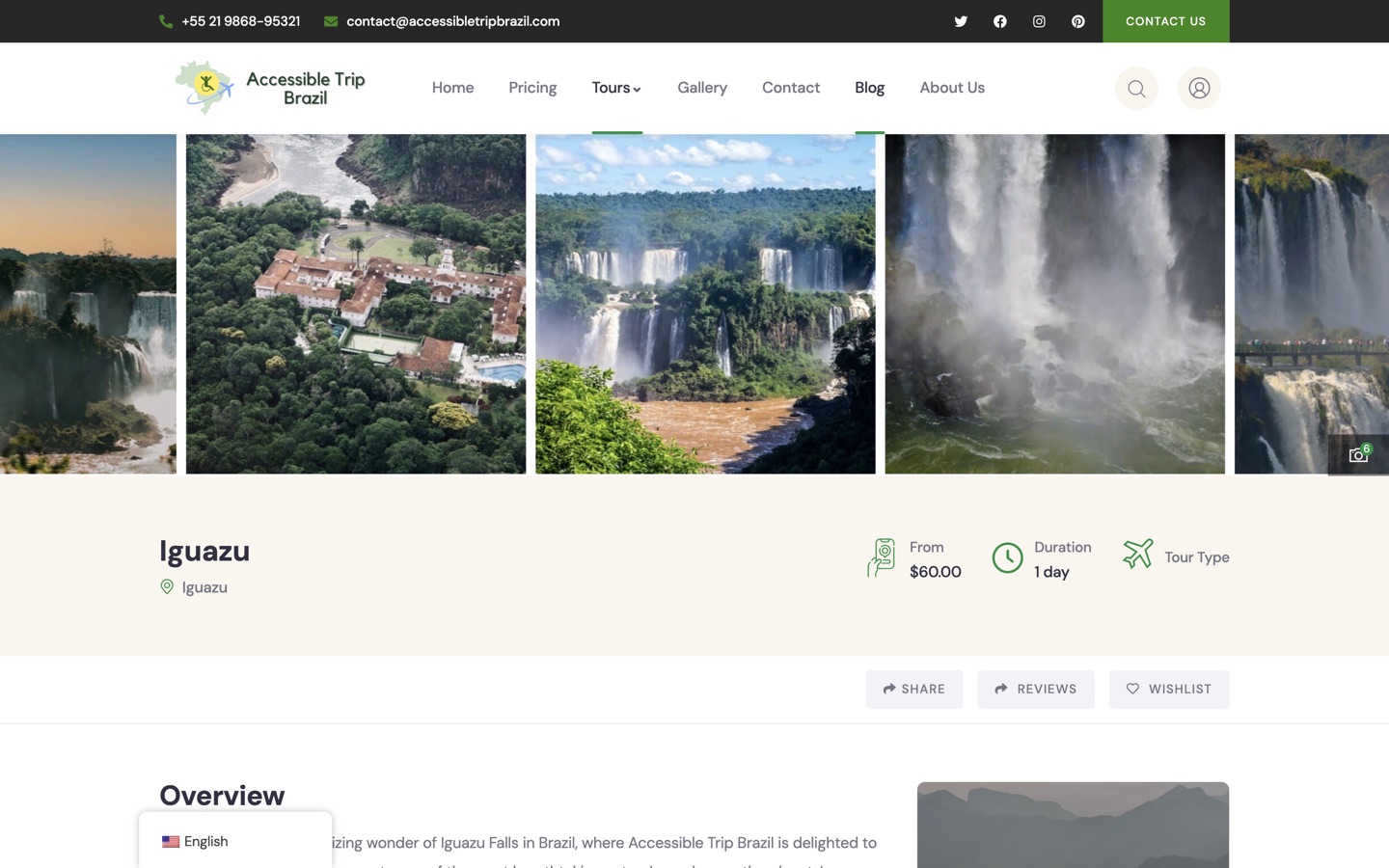
Iguazu carries the same pricing, duration, inclusions, plan and review structure as Rio. Depth is consistent rather than concentrated on the flagship.
No thin pages in the catalog
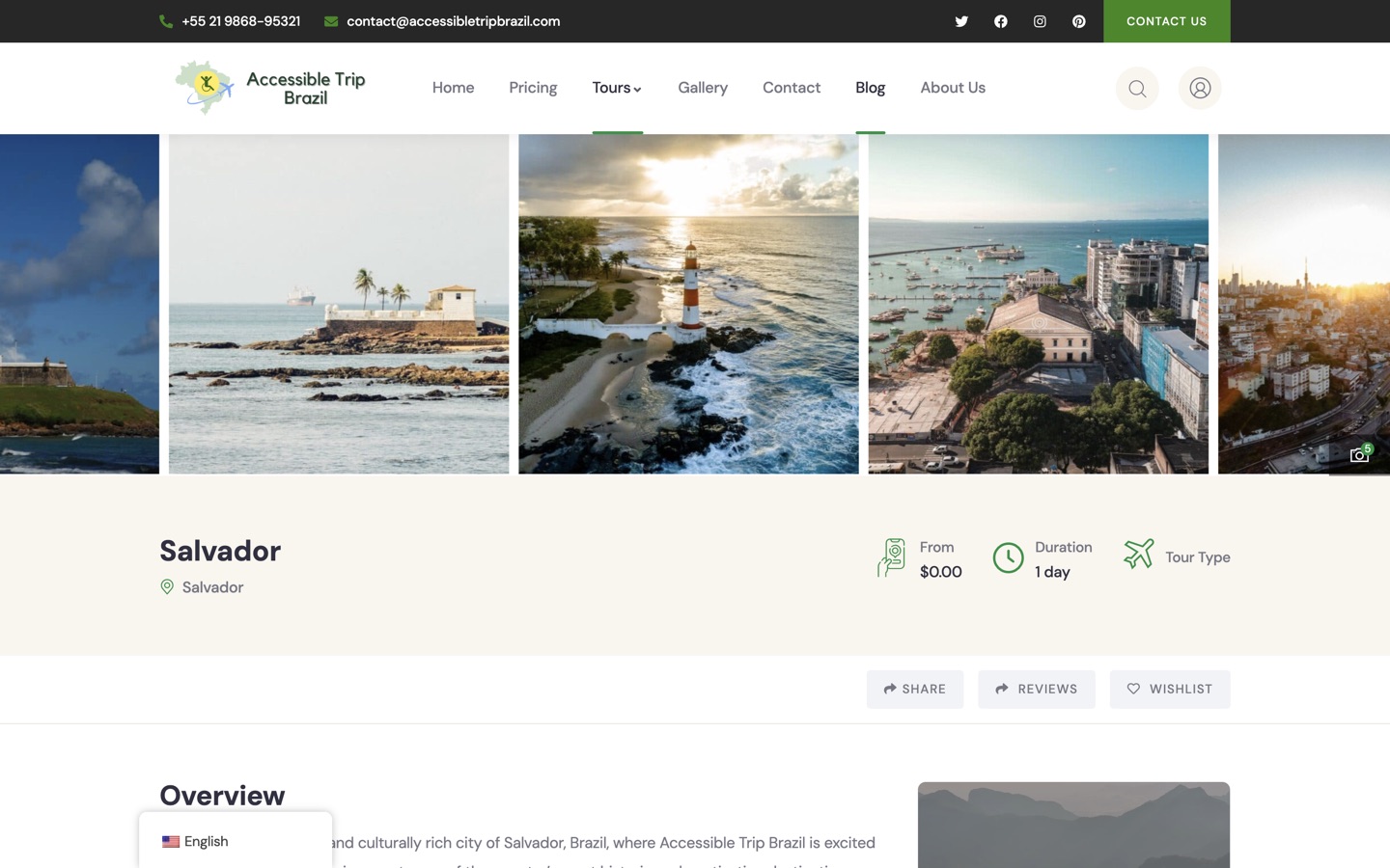
Repeating a rich page structure across 9 destinations and 6 languages is what turns 40 pages into 240 without the quality dropping.
40 routes, 6 editions, 240 total
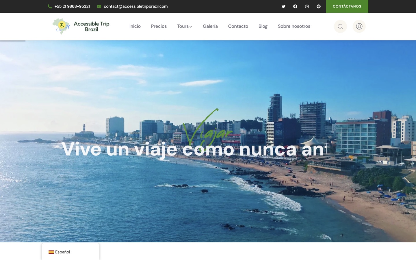
A Spanish visitor gets the whole site in Spanish: navigation, tours, articles, chat copy and calls to action, so research never breaks back into English.
Complete editions, end to end
A specialist audience, six languages, a heavy media library and a delivery model that had to be both fast and simple to operate.
Travelers with disabilities and their companions need more information and more confidence before contacting a company than a typical leisure buyer.
Six locales had to cover the entire route set, not just a translated homepage that abandons visitors on the second click.
Hundreds of high-resolution destination photographs had to keep their quality while the pages stayed responsive.
Carousels, hero transitions, entrance motion, sticky navigation and the lightbox are all things visitors perceive as the product.
Public pages should not depend on a live CMS, PHP runtime and database on every single request.
The final package had to fit a manual Cloudflare workflow with hard file-count and file-size constraints.
Lead with the emotional pull of Brazil, then answer the practical access questions that follow.
Tour pages that answer pricing, duration, inclusions, route and guest questions before an enquiry.
Six full editions so an international visitor never falls back into English mid-journey.
Treat 205 high-resolution images as product proof, with an interaction model worth using.
Progressive loading and lazy embeds so an image-heavy site still opens quickly.
Static output on the edge, removing the CMS runtime from every page request.
Verify routes, assets, media, favicons and content rather than assuming the build is complete.
Emotional discovery, then relevant tours, then access and logistics, then proof, then a low-friction conversation. That is how an accessible-travel buyer actually decides.
Customized accessible travel depends on a conversation about equipment, transfers, companions and dates. A registration wall would filter out the exact customers this business wants.
We did not invent a payment or inventory backend the operation does not run. Forms serve the inquiry journey honestly rather than implying a transaction that cannot complete.
Full-resolution originals, verified byte-for-byte, with a preservation archive kept separately so the deployed frontend stays light without losing anything.
Serving coded static output from the edge removes the CMS, runtime and database from every public request, which cuts both latency and the maintenance surface.
Routes were packed into deterministic files so 240 pages fit a manual upload workflow without dropping a single one, and static assets bypass the router entirely.
In this niche, photographs are evidence. The viewer had to be as good as the pictures.
A 240-route site cannot be spot-checked by eye. Every layer was audited and recorded.
Not a promotional page, but a complete international content and conversion system.
An international visitor can research an entire trip without ever being dropped back into English.
Static edge delivery removes the CMS runtime from public requests, cutting both latency and the maintenance surface.
High-resolution imagery with a real viewer turns the archive into working proof rather than a decorative grid.
Destination pages, tour detail and 16 editorial guides catch travelers from early research through to booking intent.
WhatsApp, phone, email and forms with no registration, which suits a customer who needs to explain individual requirements.
Route, asset, media, favicon and content audits mean the site can be re-verified after any future change.
Because a content site does not need a database on every page view:
By auditing rather than eyeballing:
No, and we would rather say so plainly:
By separating what is shown from what is loaded:
Scale is mostly a discipline problem rather than a design one:
Hundreds of pages across several languages is a discipline problem. We build the system, then prove it route by route.