Everyone claims the same 4 things
Results driven, data led, passionate about growth. The vocabulary of this industry has been worn smooth, so any claim made in those words is read as noise before it is read as meaning.
This is our own site. No brief to hide behind, no budget to blame, no stakeholder who wanted the logo bigger. Just 8+ years of marketing work in this niche, turned into a design system we now hold every client project to.


15 pieces of our own site, and the reasoning behind each one.
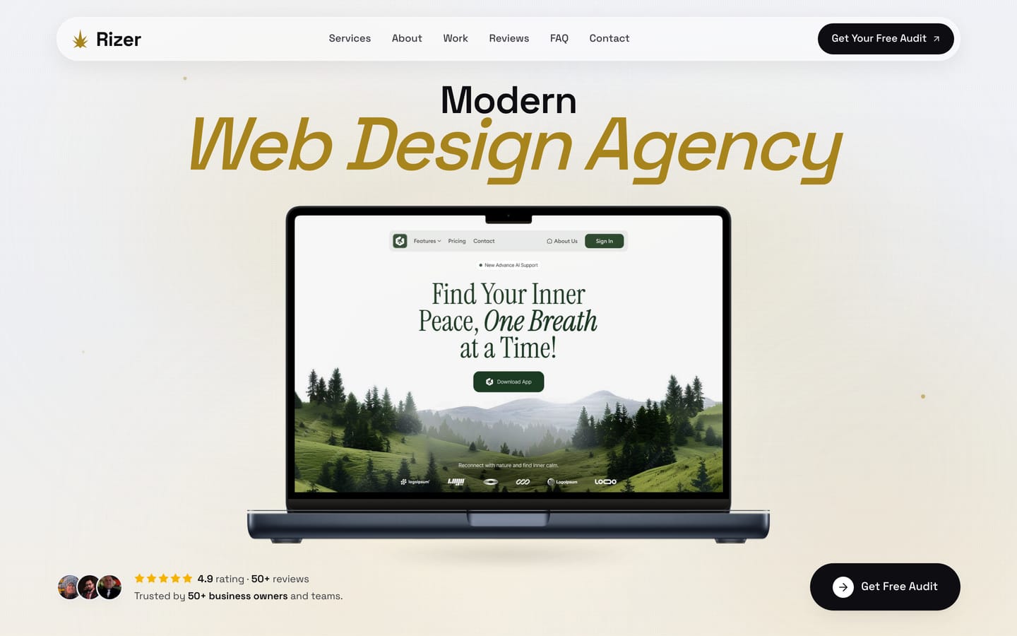
Most agency sites open on an abstract promise. Ours opens on a real client site inside a laptop, with the rating and the client count directly beneath it. A visitor forms a judgement about whether we can design in about 2 seconds, so the fastest honest answer is to show them something we designed.
Proof above the fold, not below it
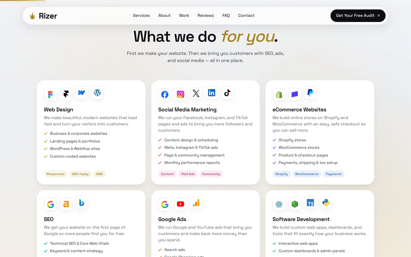
Web design, social media, ecommerce, SEO, Google Ads and software development. Every card carries the actual platform logos and a plain list of what is included, because a business owner comparing agencies wants to know whether we work in Shopify or WooCommerce before they want our philosophy.
Platforms named, not implied
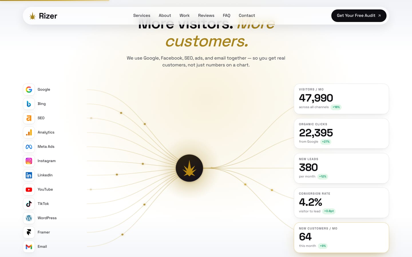
An animated diagram pulls every channel we work in, from Google and Meta to SEO and email, into a single centre and out to the metrics a business actually tracks. It is the clearest way we have found to make the point that these are not separable line items. The figures shown are illustrative of the model, not a specific client result.
One connected system, drawn rather than described
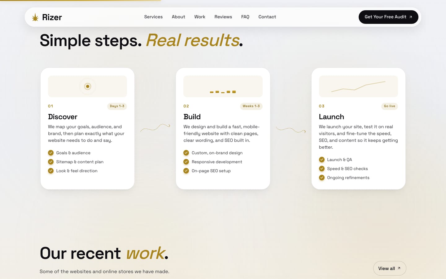
Discover, Build, Launch. Each card lists the concrete deliverables and carries a small progress illustration, so the process reads as a schedule rather than as reassurance. Clients who have been burned before are looking for evidence that someone has done this in an orderly way, repeatedly.
Deliverables listed under every phase
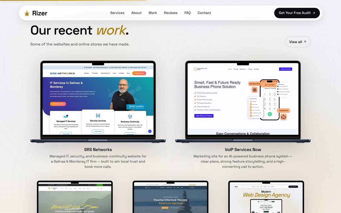
Every card is a live screenshot in a MacBook frame at true retina proportions, captured rather than mocked up. It sounds pedantic, and it is the difference between a portfolio that looks like a template and one a prospective client can verify by opening the site themselves.
Captured at 1440 by 900, never stretched
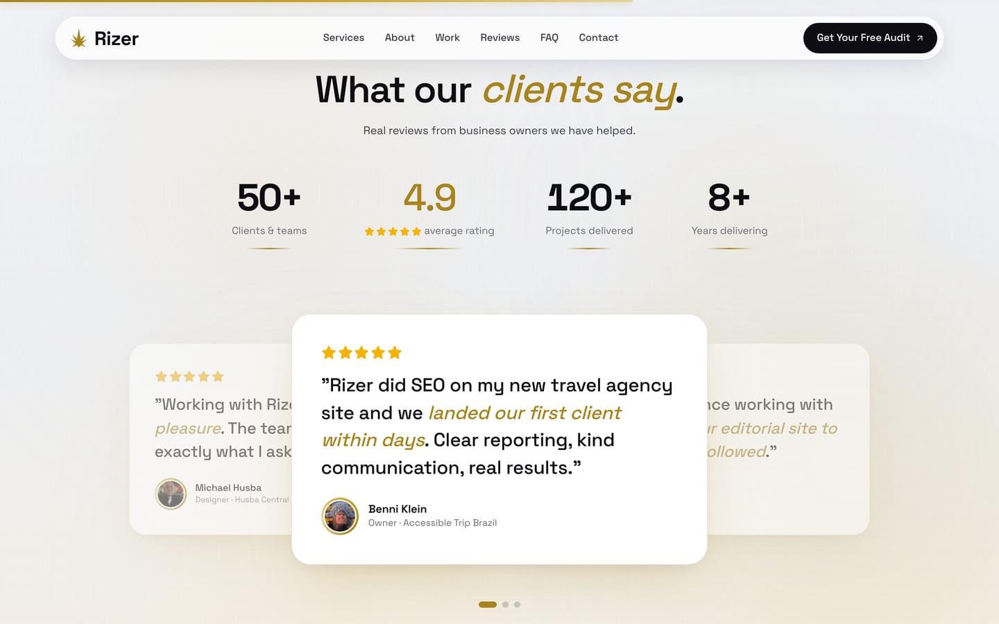
50+ clients and teams, a 4.9 average rating, 120+ projects delivered and 8+ years doing this work, followed immediately by named reviews from the business owners behind them. A statistic without a name attached is decoration, so the two sit together.
Every review carries a name and a business
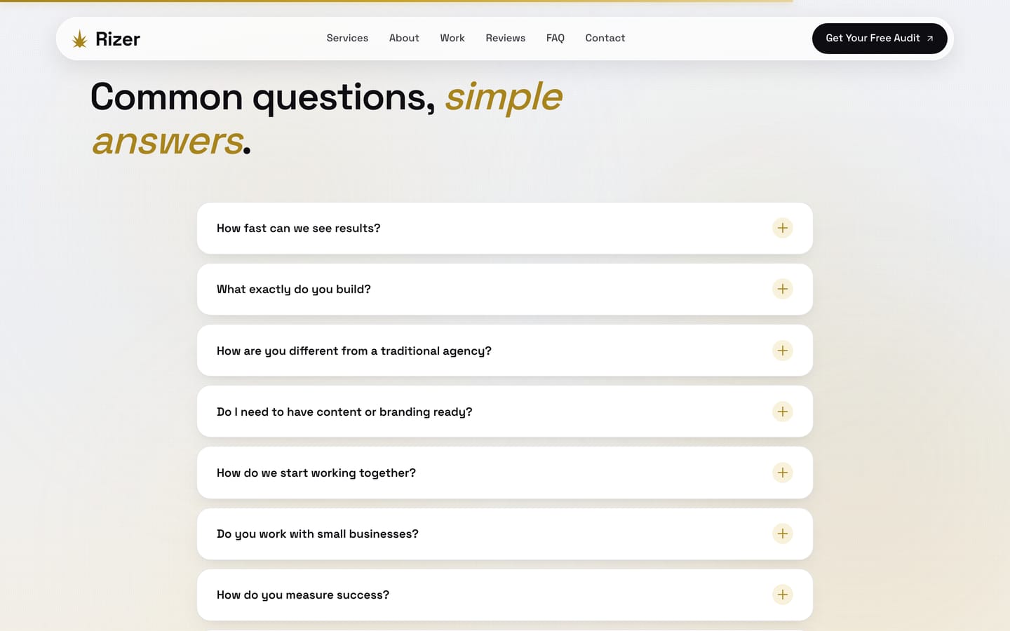
How fast can results appear, how we differ from a traditional agency, whether content needs to be ready, whether we work with small businesses. These are the questions that stall a decision. Answering them on the page means the first call starts from a better place than a list of doubts.
7 objections handled in public
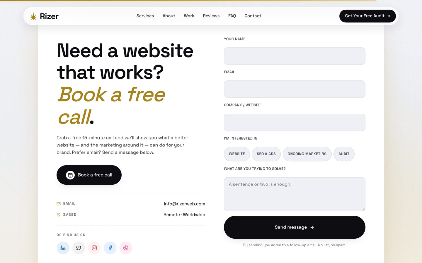
A 15 minute call for the people who want to talk, and a short form for the people who do not. The form asks what they are interested in as selectable options rather than making them compose a brief. Fewer people abandon a form when the hardest field is optional.
Call or write, no forced funnel
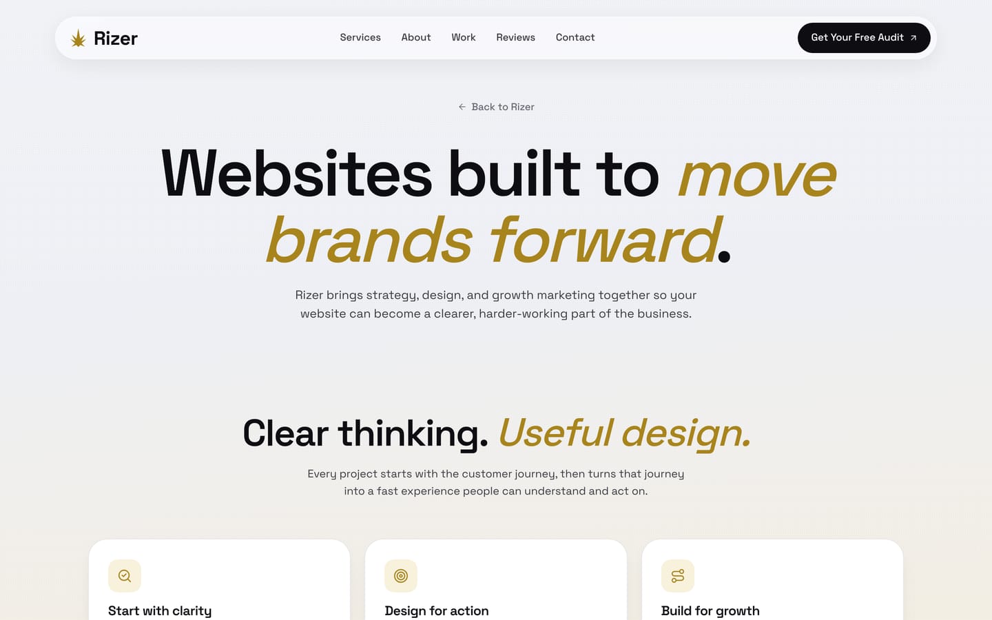
Clear thinking, useful design, and a stated sequence of start with clarity, design for action, build for growth. Agency about pages usually try to appeal to everyone and end up describing nobody. This one names how we work so the wrong-fit enquiries can rule themselves out.
Written to filter, not only to attract
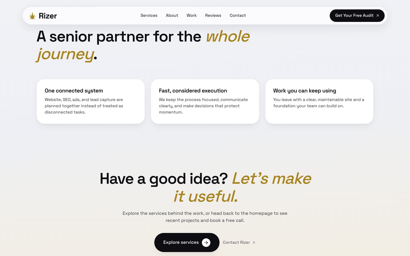
The argument for using one team across design, SEO, ads and content, rather than briefing four suppliers who never speak. This is the single most useful thing 8+ years in this niche taught us: most marketing underperforms because nobody owns the joins between the parts.
The case for a single owner across channels
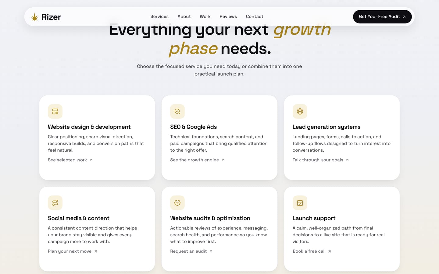
The homepage summarises 6 services. The services page gives each one its own card with a route onward to the relevant proof, whether that is the portfolio, the growth engine or a call. Layering it this way keeps the homepage scannable without punishing the researcher.
Every service links to its own evidence
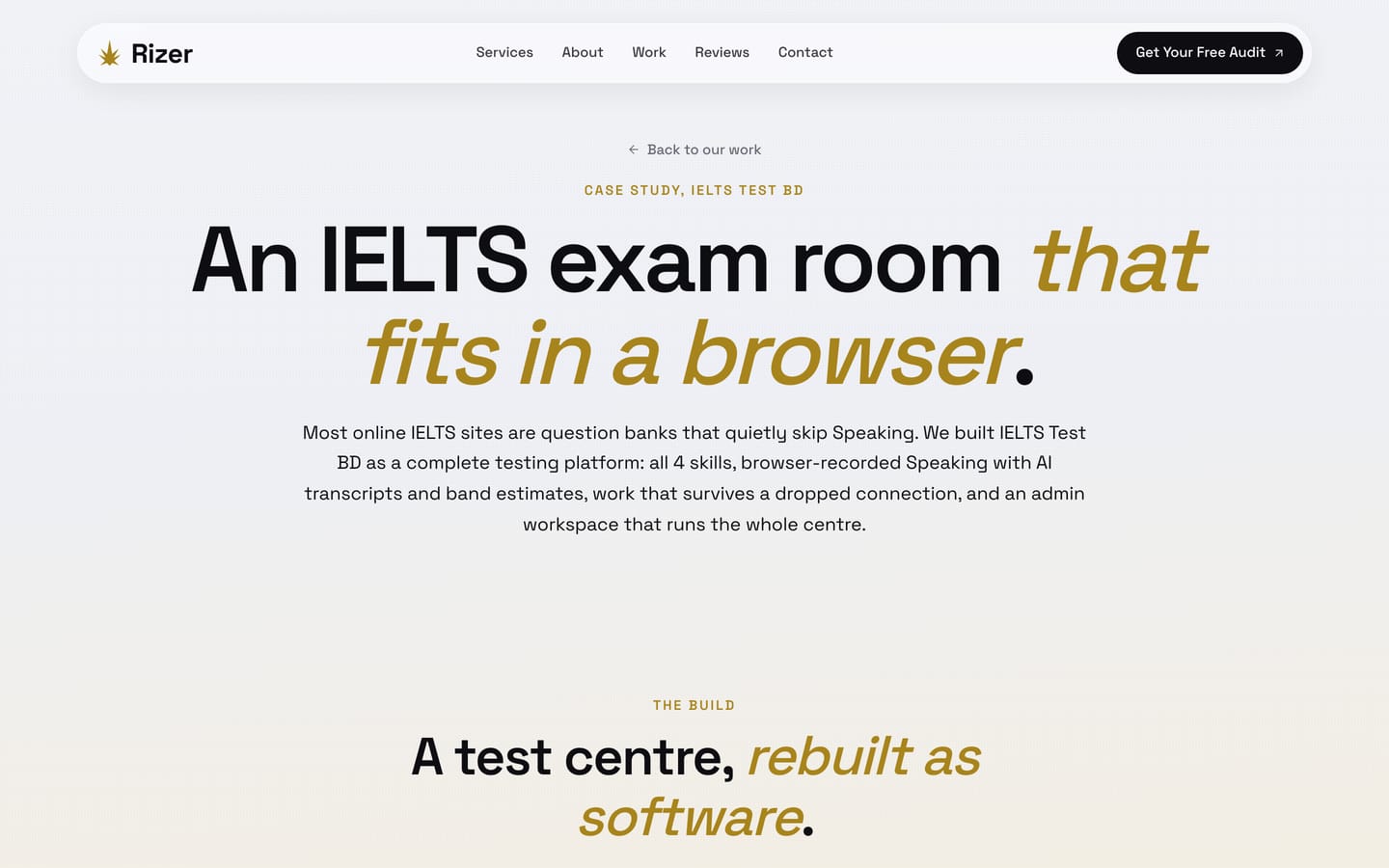
Every project page runs the same order: hero, site view, 15 real screenshots, client story, scope, challenge, goals, strategy, comparison, results, impact and questions. A reader who has seen one knows how to read the next, and the consistency is itself an argument about how we work.
1 structure, 8 projects, no exceptions
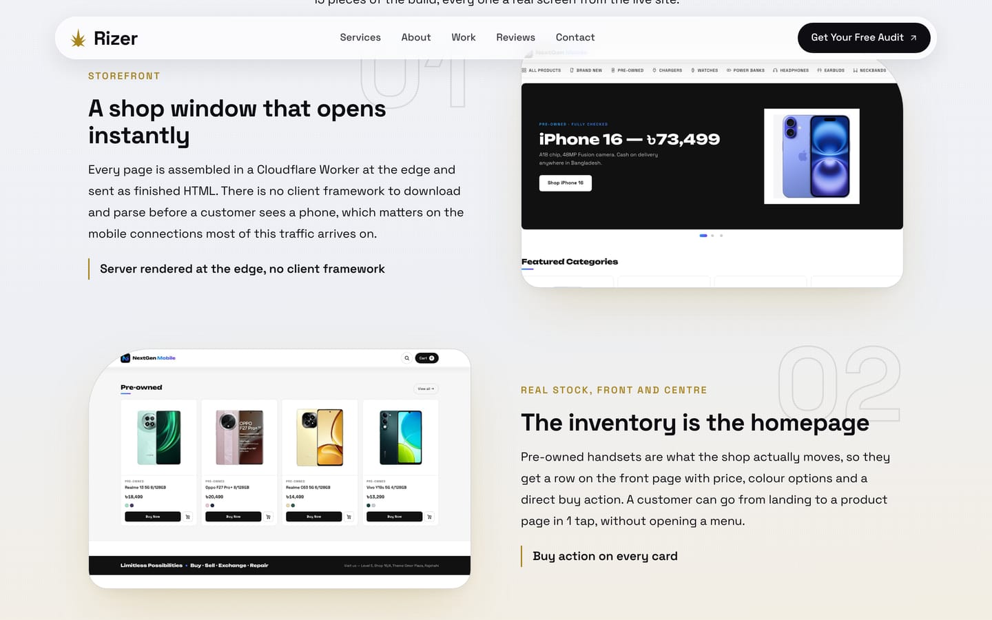
Each of the 15 blocks per case study pairs a real screenshot with a number, a label, a claim and a single note underneath. The alternation gives the eye a rhythm over a long page, and the note means a skim reader still leaves with the point of every section.
120 screenshot blocks across the portfolio
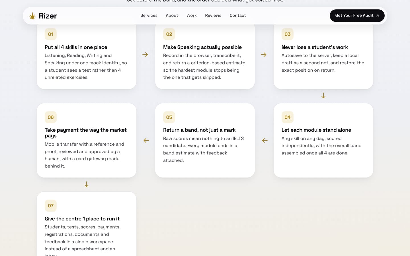
Seven goals laid out as a serpentine path with arrows that turn at the end of each row. It would have been quicker to use a 3 column grid, but the goals were agreed in an order and the order carries meaning. The component was built for that argument and gets reused wherever sequence matters.
Built for the content, not chosen from a kit
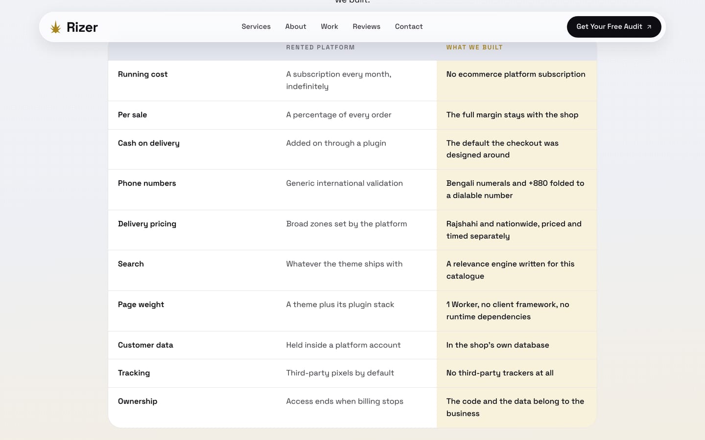
Criterion, before, after. On a desktop it reads as a table; below 700 pixels each row restacks into a labelled card so nothing is squeezed into an unreadable column. Comparison tables are where most responsive designs quietly break, so this one was built mobile first and checked at 390 pixels.
Restacks to cards, never scrolls sideways
The problems specific to selling design and marketing to people who have been sold it before.
Results driven, data led, passionate about growth. The vocabulary of this industry has been worn smooth, so any claim made in those words is read as noise before it is read as meaning.
A restaurant can have a mediocre website and great food. A design studio cannot. Ours is the first and often the only sample of our work a prospect will judge us on.
A large share of enquiries come from owners who already paid someone and got a site that never produced anything. They are not looking to be impressed, they are looking for reasons to disqualify.
The market is used to hiring a designer, then an SEO, then an ads person. Explaining why that split is the problem takes more than a services list.
Client work is always more urgent than your own site. Left unmanaged, an agency site sits half finished for years, quietly contradicting everything the agency says about launching.
With no client to approve anything, the only quality control is the standard you set yourself. It is remarkably easy to accept things on your own project you would flag on someone else's.
What we set out to make the site do, and the order we solved it in.
Open on real client work rather than a claim, so the question of whether we can do this is answered before anyone reads a sentence.
Six named services with the actual platforms listed, so a visitor can match us to their problem in one pass.
Show design, search, ads and content as one engine, because that argument is the reason to hire us rather than 4 freelancers.
Ratings, project counts and reviews attached to real businesses, positioned so the numbers and the people are read together.
Deal with timelines, pricing worries and fit on the page, so the first conversation is not spent clearing doubts.
Full case studies for the people who read everything, without slowing down the people who decide in 30 seconds.
Most of this traffic is mobile, so every component had to work at 390 pixels before it was considered finished.
Where we chose the harder option, and why.
An agency describing its own quality is the least credible sentence on the internet. A real screenshot of a real site in the first viewport does the same job without asking anyone to take our word for it.
Space Grotesk carries every level of the hierarchy, with italics doing the emphasis a second family would normally do, and a single gold as the only accent. Restraint is harder to hold than variety, and it is what makes 8 case studies feel like one studio.
The site is hand-written HTML, CSS and JavaScript with no framework and no builder. It means every component is exactly the size it needs to be, the pages load fast by construction, and nothing on the site depends on a plugin we do not control.
We could have designed each project page around its own story. Holding one structure across all 8 is more work and less fun, and it is what turns a portfolio into a body of work rather than a set of one-off pages.
Every portfolio image is a real page captured at true retina proportions from the live site. Nothing is a stretched placeholder or a stock frame, which means a sceptical visitor can open the site and see the same thing.
Most of this audience arrives on a phone. Every table restacks, every grid collapses, and the whole site is audited at 390 pixels for horizontal overflow before anything ships. It is unglamorous and it is where competitor sites usually fall apart.
The pieces reused across every page and every case study.
The choices that separate this from the sites it sits alongside.
Our own numbers, and the size of the portfolio this site carries.
How holding our own site to this standard changes the work. These describe the intent behind the build, not measured outcomes.
Rather than explaining what we would do for a client, we can point at a page and say this, at this standard, for you. It removes most of the abstraction from a first conversation.
Naming the way we work and answering the awkward questions up front means people who want something else stop before they book, which is a feature rather than a loss.
Because every case study runs the same components, the next one is a content problem rather than a design problem, and it still comes out looking like the rest.
Hand-written markup with no framework and no builder means the pages carry only what they use, which is the simplest performance strategy there is.
Anyone can check the claims here by opening a client site or shrinking a window to 390 pixels. Publishing work that can be verified is a stronger position than describing it.
Every argument on this page is one we make to clients. Making it on our own site first means we have already paid the cost of the advice we give.
Yes, and we included it in the portfolio on purpose:
It means the whole span has been spent on the same problem rather than adjacent ones:
Because for a site this size the tradeoff runs the other way:
Yes. This site is our voice, not a template we apply to everyone:
The same standard, aimed at your business rather than ours:
Everything on this page is what we do for clients. Tell us where the business is going and we will show you what it would look like.